Here’s the website-design guide from the Reel. We’ll follow the same five steps, from a website that inspires you to files you can hand over for implementation.
- 01Reference
- 02Your context
- 03Design prompt
- 04Design
- 05Implementation
For your first try, choose one page: a personal website, a service or a product. You’ll need a browser, Claude or Codex, and access to Claude Design or Stitch. Your first result will be a draft to review and improve.
1. Find a reference on Awwwards
Open Awwwards, choose a website you like, and visit the live site. It can be from a different industry. Look for a design character that suits your product.
- Check the recognition on the project’s page, such as Site of the Day or Honorable Mention.
- Look at the first screen, two more sections and the mobile version. Save the link to the actual website.
- Write down 2–3 features you want to use: heading style, color combinations, cards or the rhythm of sections. Note anything that would not fit.
The reference from the Reel: Quoti
getquoti.ai ↗ · Honorable Mention, February 22, 2026 ↗
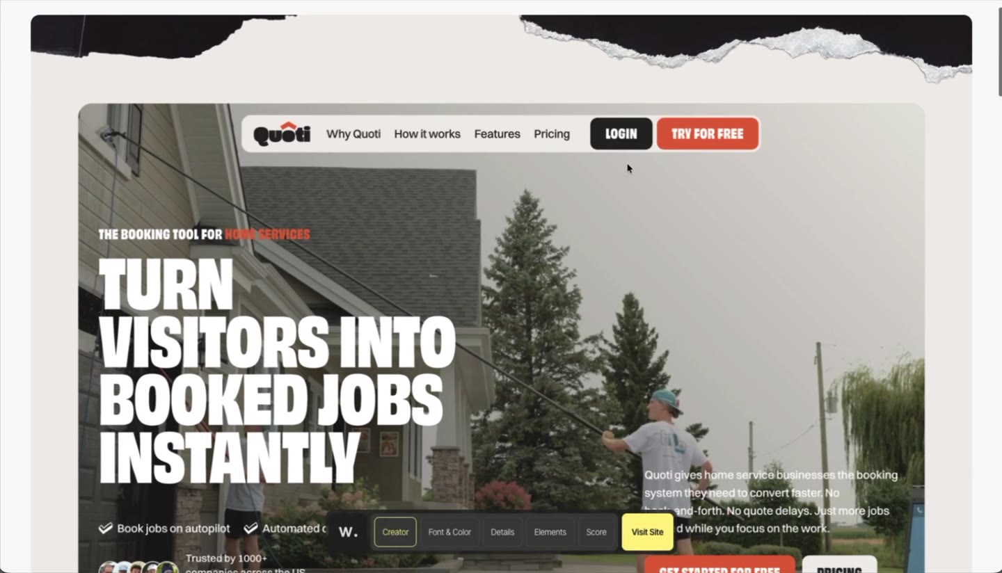
You can adapt large type or bright buttons to your own service. The logo, copy and characters should be yours. Even a beautiful effect is worth removing if it makes the page hard to read.
You’re ready to continue when
You have a link to the live website and can explain what you like about it in your own words.
2. Give Claude or Codex the link and context
Start a new conversation. Send the reference URL and your impressions. Here’s an English translation of the message from the video:
Reference: https://www.getquoti.ai/

I like the bright style and the loud type. It feels like I’m looking at a comic book rather than a cleaning-service website!
For your own attempt, replace the URL and comment. Plain language works: “I like the large headings and contrast. I don’t want a dark background.” AI should turn this into specific choices.
Add a short brief for your website
Fill in the brackets and send it in the same conversation. Choose one primary action: contact you, book a time, apply or try the product.
Reference: [website link]
What I like: [2–3 specific features and why]
What I do not want to carry over: [elements that do not fit]

My website:
- Product or business name: [name]
- What it does: [one plain sentence]
- Who it is for: [who will visit and what they need]
- Primary action: [for example, book a consultation]
- Website language: [language]
- Page type: [for example, a one-page website]
- Required sections: [offer, services, how I work, questions, contact]
- Materials: [my copy, logo, photos, real testimonials, or “not available yet”]
- Constraints: [brand colors, style, important requirements, or “none”]

Use my information. Do not invent testimonials, customers or numbers.
If AI cannot see the website, attach screenshots of the first screen and 2–3 sections. Add a separate mobile screenshot if you want the mobile design analyzed. Providing a link does not mean AI has viewed the design.
You’re ready to continue when
The conversation includes the reference, your preferences, product description, audience, language and primary action.
3. Get a detailed design prompt
Paste the instruction below into the same conversation. It’s translated from the original instruction used in the Reel. It asks AI to study the design and produce one prompt you can take to another tool.
Based on the website link and my comments above, prepare one detailed prompt for Claude Design that I can copy and use to design my own website.

First, open the reference in a browser and study its visual design. Separate what you actually see from your assumptions. If you cannot view the website’s visual design, ask for screenshots before writing the prompt. Do not invent details.

Turn my impressions into specific design decisions. For example, “it feels like a comic book” should translate into typography, outlines, composition, illustrations and rhythm, rather than just the word “comic” in the prompt. Give priority to the features I mentioned.

In the finished prompt, describe:
1. The overall style, mood and impression visitors should get.
2. A palette with HEX codes and color roles: backgrounds, text, accents and buttons. Mark approximate colors as recommendations.
3. Typography: the character of the fonts, available alternatives, heading sizes and weights, and body-text readability.
4. Composition: grid, content width, spacing, density and the sequence of sections.
5. The first screen: navigation, main headline, short description, primary action and key visual.
6. The page structure and the design of each section. Adapt the content to my product, rather than the business in the reference.
7. Buttons, cards, forms, outlines, shadows, illustrations and other distinctive elements.
8. Suitable animations, hover states and mobile behavior. Consider contrast, visible focus and reduced motion.
9. What to avoid to preserve the chosen design character.

Use the reference as a source of visual principles. Do not copy its logo, text, characters or brand images. If there is no information about my product in this conversation, leave clear fields for [Product name], [What it does], [Who it is for], [Primary action] and [Website language]. Do not invent testimonials, customers or numbers.

The prompt must stand on its own: include the reference link and the necessary context, without phrases such as “as discussed above.” Write it in English as a direct instruction for creating a design, with specific requirements rather than general words such as “modern” or “beautiful.” Ask for desktop and mobile page designs, without writing code at this stage.

Return only the finished prompt in one code block, without an introduction or explanation, so I can copy it in one click.
Review the response before copying it
- Your product, audience and primary action are filled in. There are no stray placeholders in square brackets.
- It contains specific requirements for colors, typography, the first screen, sections and mobile design.
- Observations about the reference are separate from recommendations. AI is not presenting assumptions as exact measurements.
- The content fits your business. There is no borrowed logo, invented testimonial or made-up number.
See the full prompt generated in the Reel
This is an English translation of the actual response for Quoti. Fill in the product fields before using it. “Observed” labels describe claims in that response; check them against the current site. Its proposed colors and fonts are suggestions, rather than your brand rules. Check that the fonts support your website’s language.
You are an art director and web designer. Design a one-page website for my product in the style described below. Deliver desktop layouts (1440 px wide), mobile layouts (390 px wide), and a short style sheet covering colors, fonts, corner radii, shadows and buttons. No code is needed at this stage, only the design.

PRODUCT (filled in by me; do not invent anything)
- Name: [Product name]
- What it does: [What it does]
- Who it is for: [Who it is for]
- Primary website action: [Primary action]
- Website language: [Website language]
Do not invent testimonials, customers, partner logos, user counts or other numbers. If social proof is needed but no data is provided, leave a clearly marked empty block “[Real testimonial / number, if available]” or omit the section.

REFERENCE (a source of visual principles)
https://www.getquoti.ai/ is the website of a service-booking application. Do not copy its logo, text, photos, characters, illustrations or exact composition. Use only the principles described below. In this prompt, [OBSERVED] marks what the original analysis reported measuring on the live reference page, while [RECOMMENDED] marks proposed choices for the new design.

DESIRED IMPRESSION
The client likes a bright style and a “loud” font, as though they are looking at a comic book rather than a typical website. Visitors should notice this within two seconds of seeing the first screen. The tone is confident, direct and slightly bold, while remaining clear and trustworthy. Avoid a corporate startup feel.
Turn “comic book” into concrete decisions; follow these rather than merely hinting at comics:
- Typography: huge all-caps headings with very tight line spacing.
- Outlines: thick dark borders (1.5–3 px) on cards and large containers.
- Hard offset shadows without blur, like a sticker or comic panel.
- Tilted elements (cards and photo tiles) rotated by up to approximately 15 degrees to interrupt the strict grid.
- Torn-paper edges as section dividers and photo frames.
- Hand-drawn doodles around headings (zigzags, a crown, a moon with Zzz, outlined arrows).
- Abrupt background changes between dark, light and colored sections, without smooth gradients.

1. OVERALL STYLE AND MOOD
A warm paper base, near-black blocks, one strong accent and one secondary color. Flat, without gradients or glass effects. Arrange elements like stickers on a table: outlines, hard shadows and gentle tilts. Use doodles only as accents near headings, rather than background decoration. Humor in the copy is welcome if it does not obscure what the product does.

2. PALETTE
[OBSERVED in the reference, for context; do not copy]: dark #252322, warm light background #f0ece8, secondary background #dbdbd3, orange accent #fd5b2c, purple #7d5ba6, green #8ba02c, and white.
[RECOMMENDED for my website] (if I have a brand color, replace the accent with it):
- Ink (text, outlines, shadows and dark sections): #1E1B1A.
- Paper (main background): #F4EFE6.
- Paper 2 (alternating sections and large containers): #E3DDD0.
- Strong accent (primary buttons and key words in headings): #FFD23F, with #1E1B1A text.
- Secondary (pain-point cards and the colored “how it works” section): #5B3FE8, with white text.
- Doodles and small accents: #FF5A5F.
- Success or positive labels: #2DBE7E.
Contrast rules: white on #5B3FE8 has a ratio of approximately 6.8:1. Do not put white text on orange or yellow buttons. Do not make small text translucent on colored backgrounds.

3. TYPOGRAPHY
[OBSERVED]: headings use the heavy, wide sans-serif Obviously, weight 900, all caps, line height 0.85 and letter spacing -1%. At a 1280 px viewport: hero heading 105 px, large statements 149 px, section headings 59–78 px, card headings 36 px, small labels 22 px with +2% letter spacing. Body text uses Switzer, weight 500, 19 px, line height 1.4 and letter spacing -1%. Buttons and footer use the same display font in all caps.
[RECOMMENDED] free alternatives (Google Fonts): headings in Archivo (variable, width 100–125, weight 900) or Anton, all caps; body text in DM Sans or Inter, weight 500, 18–20 px on desktop and 17–18 px on mobile. Use clamp() for headings: hero 64–120 px on desktop / 44–56 px on mobile; large statements 56–140 px / 40–56 px; section headings 40–72 px / 32–40 px. Use line height 0.85–0.9 only for headings, with no more than 3–4 lines. Body text must be at least 17 px, with lines up to 65 characters.

4. COMPOSITION
[OBSERVED]: a 12-column grid, floating pill navigation and alternating backgrounds: dark, grayish, light, colored, light, dark. Headings are huge and often centered; body text occupies less than half the width. There is plenty of space.
[RECOMMENDED]: maximum content width 1280 px; side padding 24 px on desktop and 16 px on mobile; vertical spacing between sections 96–160 px / 56–80 px. One main accent per screen, and no more than two ideas per section. Alternate backgrounds: Paper, Ink, Paper 2, secondary color, Paper, Ink. Between sections, use an original SVG strip with an irregular torn-paper edge.

5. FIRST SCREEN
- Navigation: a floating pill. [OBSERVED]: warm light background, 1 px outline, 16 px radius, 4 px inner padding and 64 px height. Logo on the left, 3–4 links in the middle, a dark “Log in” button and an accent primary-action button on the right. On mobile, keep the logo and hamburger icon in the same pill.
- Heading: two short parallel phrases in all caps, following “Result. Less pain.” Example structure, not final copy: “[Desired outcome]. [Less of what annoys you].” Maximize the size; align left or center. Put a key word on a slightly tilted yellow highlighter block.
- Description: 1–2 sentences explaining what [Product name] does for [Who it is for], no more than 25 words.
- Primary action: one large button labeled [Primary action], with 2–3 short benefit labels and check marks beside or beneath it.
- Key visual: a real product screenshot in a tilted frame with an outline and hard shadow, with 1–2 doodles nearby. Do not use stock photos or invented faces.

6. PAGE STRUCTURE (adapt it to my product)
1. First screen (Ink or Paper).
2. Pain points: a heading and three tilted #5B3FE8 cards, with a 1.5 px outline, 24 px radius and 6 px 6 px 0 #1E1B1A shadow. Each has a short 36 px heading and 1–2 sentences about a real problem faced by [Who it is for]. Use the data I provide; do not invent statistics.
3. Large statement: one giant centered heading, up to three lines, with two doodles around it; beneath it, 1–2 sentences and a button.
4. How it works: 3–4 steps in a colored section, each with a large number, heading, short description and slightly tilted dark rounded panel containing a product screenshot.
5. Features: a 2×3 grid, or alternating image-left / image-right cards with outlines.
6. Social proof: real data only; a paper-sticker frame for photos, with outlined navigation arrows.
7. Frequently asked questions: an accordion on an Ink background, with all-caps questions.
8. Final call to action: a large outlined panel with a torn edge inside, a heading, text and one button.
9. Footer: display-font links in all caps and legal links, without clutter.

7. BUTTONS, CARDS, FORMS AND ELEMENTS
- Buttons [OBSERVED]: 12 px radius, 20 px 24 px padding, 1.5 px outline in the same color as the fill, and all-caps display text. For my website: primary button with #FFD23F fill, #1E1B1A text, a 2 px #1E1B1A outline and a hard 4 px 4 px 0 #1E1B1A shadow; secondary button with an Ink fill and white text; minimum size 48 px.
- Cards: 24 px radius, 1.5–2 px #1E1B1A outline, 6 px 6 px 0 #1E1B1A shadow, 32–48 px padding, and rotation from -4 to 6 degrees.
- Large containers: 32 px radius, 3 px outline and 8 px 8 px 0 shadow.
- Form inputs, if needed: height 56 px, radius 12 px, 2 px outline; a thicker outline and yellow shadow on focus.
- Icons: outlined, 2 px stroke, without fills.
- Doodles: 4–6 across the whole page, hand-drawn outlines in #FF5A5F and #5B3FE8. Create original doodles related to my product; do not repeat the reference’s crown, Zzz moon or zigzag.
- Images: interface screenshots in tilted frames; photos with torn edges only if I provide real photos.

8. ANIMATION, STATES, MOBILE AND ACCESSIBILITY
- [OBSERVED]: the hero heading appears with a line-by-line mask; pain-point cards move horizontally and rotate during scrolling; service tiles are tilted in a fan. Hover states were not checked.
- [RECOMMENDED]: show hover, focus and active states for buttons and cards in the designs. Button hover: move 2 px up and left, with the shadow increasing to 6 px. Active: press the button down and remove its shadow. Card hover: straighten to 0 degrees over 200 ms. Section reveal: move up from 24 px below while fading in over 300–400 ms.
- Required: visible focus with a 3 px #5B3FE8 outline and 3 px offset; prefers-reduced-motion disables animated tilts, parallax and automatic carousels (static tilts remain); text contrast at least 4.5:1, or 3:1 for large text; tap targets at least 44 px.
- Mobile: one column, rotations reduced to 2–4 degrees, cards stacked vertically or in a swipe carousel with a visible cue, pill navigation with a hamburger menu, primary-action button fixed at the bottom or repeated after every two sections, and headings no longer than three lines.

9. WHAT TO AVOID
- Gradients, blurred shadows, glass effects, stock photos and invented faces.
- A generic SaaS look: gray cards with weak shadows, small headings, and characterless symmetrical “three columns with icons.”
- Small or low-contrast text; white text on yellow or orange.
- More than two accent colors on one screen, more than six doodles, or rotations beyond 15 degrees.
- A childish look: doodles should be accents, and the product should still feel trustworthy.
- Copying the reference’s logo, text, photos, characters or exact composition.
- Invented numbers, testimonials or client logos.

DELIVER: page layouts for desktop 1440 px and mobile 390 px with all sections, hover/focus state designs for a button and a card, and a style sheet. If product information is missing, leave clearly marked fields instead of inventing it.If you want to start with the ready-made example
Add the full example prompt to Claude or Codex, then send this request with your own context:
Adapt the finished design prompt to my context below: [paste your completed website brief].

Keep the selected visual principles, but change the structure, copy and primary action to fit my audience. Replace every placeholder for which I have supplied information. If important information is missing, ask short questions. Do not invent facts. Check that the proposed fonts support my website’s language.

Return only the updated, self-contained prompt in one code block.
You’re ready to continue when
You have one self-contained prompt for designing your own website. It makes sense without the previous conversation.
4. Create the design in Claude Design or Stitch
Choose one tool. Paste the finished response from step 3. The instruction in the previous step is used to prepare that response.
Claude Design
Open Claude and start a design from a conversation or the Artifacts tab. If your account still has the separate Claude Design experience, you can start there. Paste the prompt and add your materials.
Open Claude ↗Stitch
Open Stitch, start a new design and paste the same prompt. Add a reference screenshot if you want to clarify the style. Ask for the whole page and its mobile version.
Open Stitch ↗Focus on reviewing the design here. The tool may create a working prototype or code behind the scenes. Leave publishing and form connections for implementation. The Claude Design guide explains current ways to start. Action names and availability may differ in your account.
Look at the website as a visitor
- First screen. Can you understand within a few seconds what is offered, who it is for and where to click?
- Mobile design. Are headings and text readable at around 390 px wide? Does anything extend beyond the edge?
- Language and fonts. Do special characters and currency symbols display correctly? Is there enough contrast in the text and buttons?
- Content. Does every section serve your audience? Are there any invented facts?
If something is wrong, give 2–3 precise changes. For example: “On mobile, the headline takes six lines. Shorten it to three while keeping the meaning.”
Keep the overall style. Change only the following:
1. Where: [specific section, and desktop or mobile].
   Problem: [what makes the website hard to read or understand].
   Change: [the result I want].
2. Where: [section]. Problem: [description]. Change: [description].
3. Where: [section]. Problem: [description]. Change: [description].

Show the updated desktop and mobile designs. Leave the other sections unchanged. Do not add invented information.
You’re ready to continue when
Both desktop and mobile designs are clear, readable and appropriate for your product. You’ve chosen the final version.
5. Download the design and hand it over
Save the final version and its files first. Put everything in one folder, such as my-website.
- Claude Design: in Export, choose ZIP for the project files or standalone HTML if it suits your handoff. The action name may differ in the older separate interface. Official export guidance ↗
- Stitch: save the design and the available HTML/CSS export. Google also describes a Figma handoff, but files for implementation are convenient for this workflow. Check the exact options in your project. Google’s feature overview ↗
What to put in the folder
- The ZIP or other exported files, plus screenshots of the final desktop and mobile designs.
- The final design prompt and your completed website brief.
- Your copy, logo, photos and fonts you have permission to use.
- A list of actions: where each button leads, how the menu should work and where form submissions go.
Open Claude Cowork or Codex. Attach the files or select the project folder so AI can read them. For a local folder in Claude, use Claude Desktop and grant folder access. In the updated interface, Cowork tasks may start from a regular conversation. Cowork guidance ↗
Implement the website using the attached design files and screenshots of the final version.

Context: [paste your completed website brief].
Folder with the design and materials: [folder name or path].
Primary action and destination: [button text and real link].
Form behavior, if there is a form: [where submissions should go, or “visual mockup only for now”].
We are creating the website: [from scratch / in an existing project; specify the folder].

Read the files first. Identify the final design, required sections, fonts, colors and mobile behavior. If the folder contains several versions, ask which one to implement. If a technology choice is needed, suggest the simplest option for this task and briefly explain it.

Preserve the design’s character, but build real responsive pages rather than one image. Use the supplied copy and materials. Do not invent testimonials, numbers or client logos. Check that the chosen fonts support my website’s language, including its special characters and currency symbols.

Check the page in a browser at widths of 390 and 1440 px, plus a narrow 320 px screen: heading wrapping, no horizontal scrolling, contrast, visible focus, menu, buttons, links, forms and image loading. Explain what actually works and what still needs connecting. If a button destination or form configuration is missing, flag it and ask; do not display a fake success confirmation.

Prepare a local preview and the project files. Include short instructions for opening the website. Do not publish it, buy a domain or connect paid services without my separate permission.
The implementation example from the Reel: NoSheet
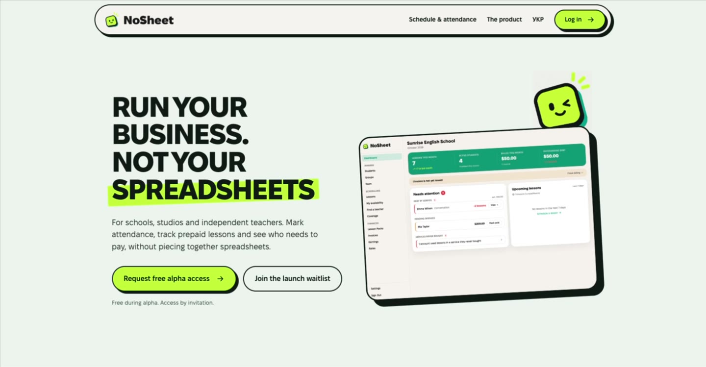
Compare it with Quoti: large headings, contrast and distinctive frames hold your attention. The offer, colors and product screenshot are its own. That’s how to adapt a reference’s principles.
Check the implemented website
Open the local preview in a browser and on your phone if it’s available. Select every button, try the menu and check the form. The design may only have shown its appearance. Ask AI to state whether real submissions are connected.
You’re ready to continue when
You have the website files, can open it, and know which actions work and what still needs connecting. Publishing is a separate step.
If you get stuck
AI describes a website it hasn’t seen
Stop the prompt generation and add screenshots. Ask for a new analysis based only on those images, with assumptions marked. Check that it matches what you see.
The result looks good, but feels like somebody else’s website
Go back to your brief. Repeat the audience and primary action. Name 2–3 reference features you want to keep, then ask AI to reshape the content around your product.
AI created only the first screen
Ask it to continue in the same style and list the required sections. Then ask for the mobile version of the entire page. Finish the design before handing it over as final.
I only have a PNG or PDF
Screenshots help recreate the appearance, but do not describe menu or form behavior. Add the design prompt, your materials and a list of actions. If possible, return to the tool and save a ZIP or HTML/CSS export.
I can’t find Claude Design or the export button
Check the current official guidance and the actions available in your account. You can use Stitch for step 4 with the same prompt. Prepare your context and prompt before deciding whether you need a different plan.
Sources and materials
Tool capabilities were checked against primary sources on October 9, 2026. Interfaces change. The examples and original prompts come from Sam’s Ukrainian website-design Reel; this guide provides English translations of the copyable material.